As part of the feedback from Beth, she suggested getting someone from outside the production to watch the film to see if they think any scenes don't add anything comedic to the film. This will be a good way to decide what needs to be cut down in order to make the film snappier, and therefore, funnier. As it was a case of refining the footage now, I felt that it was a good time to pass the edit onto Katie. She hasn't been looking at the edit as much as I have and therefore, will have a fresh mind when looking at it. She will be able to refine the film and remove parts that don't add anything comedic to the story. In addition to this, I am confident that I have done as much as I can with ordering the footage and making it resemble the final product. As I found in my research, this is as far as the rough cut goes. Once it starts to resemble the final film it is time to focus on the audio, sound effects and colour which means it is now in the fine cut stage. Although the film has now been passed on, I will still be involved with the fine cut by scheduling viewings with Katie. Similarly to the shoot days, I need to make sure the initial vision of the film is being realised. We shot the film similar to our original plans which was ideal, but as we are progressing further into the post-production stage, I need to make sure the film still holds our initial vision.
Fine cut 1
After Katie had the edit for a week, I had a viewing with her. She said that she felt the footage was all in the right places, and she only changed a few minor shots that she thought fit better. This was completely fine with me as I had been staring at the edit for over a month, and it needed a fresh mind looking at it. As the footage was pretty much in the correct order, Katie went onto fixing the audio and importing sound effects. I left the sound effects out as I concentrated purely on the footage, so it was good to see the film with more character in it with the added effects. I added in all the audio / sounds (e.g. the vase breaking, some of the owl screeches) that we had recorded but we agreed that finding the sound effects online was a part of the fine cut.
The sound effects needed were:
- The printing sound
- The additional owl screeches
- Flapping sounds / wind, air
- Thud's when they hit the dog, when Luke drops the dog at Sheila's doorstep
- Dog cry when they hit the dog
- Gameboy noises
My feedback to fine cut 1:
- The sound effects listed above add to the story really well. The printer sound really brings together the first scene which is good.
- Audio is a bit pitchy in scenes 7 and 9.
- The owl screeches really add to the idea of the owl being distressed and get the point of the scene across well.
- Katie had tweaked the owl punch and it looked a lot better to when I had it. I knew passing it to Katie at this point would be beneficial so she could look at it with a fresh mind.
- Game boy noises still to do.
- The edit is really improving and I am liking it a lot more with the sound effects included.
As I have finished my job as editor, I started to view the footage with a producer's mindset. The producer "oversee[s] post-production from editing, through music composition and picture lock" (StudioBinder, 2019). I was creating the rough cut previously, so I was involved with the picture lock because I was deciding what order the footage went in. I understand Katie will change some of the footage around if she thinks it'll look better elsewhere. However, she will inform me when she changes the footage so I can oversee it and give my feedback. From this piece of research, I have established that I will oversee each aspect of the fine cut, as I did for the rough cut. Music, audio, sound effects and colour will be down to me in the end. Once Katie has applied it to the film I can give my feedback and request it to be changed if I think it needs to be. During this time period, the producer may also "market the project and generate a buzz for the project by working with a PR team" (StudioBinder, 2019). I have started the marketing process for VET-MAN, however now I have the opportunity to take this further as I will no longer be in full control of the edit. As we are a small production group, we don't have a PR team like a large-budget film would have. However, I have commissioned Emily, an illustration artist, to help create pieces to help market the film. Therefore, I can still take on this research into the final stages of the film by getting her more involved with the marketing side of VET-MAN.
In further research I found that even if the shooting has finished, the producers can still demand that additional scenes be filmed. As I have been creating the rough cut and believe that we have got all the successful shots required for our film, it will be unlikely that I will want to re-shoot additional footage in the fine cut stage, however, this was interesting to keep in mind. I believe I will continue my marketing of VET-MAN while keeping track of the fine cut. I will schedule viewings with Katie to see how the film is developing and give feedback where it is necessary.
In the fine cut, Katie had started to work on the audio issues during scene 7 & 9 when Tim and Luke arrive at the Owl Academy for the first time. We filmed right next to a river, which we didn't notice when we visited the owl academy for previous test shoots. The wind through the trees didn't help either, as a result of this, we needed a bit of sound work done on these scenes. Katie attempted to fix the unwanted background noise, however she found this difficult as the more she decreased the background noise, the more robotic the characters voices sounded.
To work around this, Katie came up with the idea of putting in a shot of the river to first establish the noisy background before we see the characters getting out of the van. As a result of this, Katie will be able to slightly adjust the background noise but she won't need to take it out completely because we have established the idea of a river behind the characters. We had planned to conduct an ADR day. We initially were going to do this on the voiceover day, however Alex and I realised how much practice and preparation we would need beforehand. This was no problem as I spoke to Ferg about sitting with him a couple of times to learn the basics of ADR, as the rough cut editor. Once Katie realised changing the audio in scene 7 & 9 makes the characters voices robotic, I brought up the ADR day again. Up until this point, Katie and Alex both communicated that the audio issue was being solved, however, I didn't realise that they were struggling with this. As I said previously, I brought up the ADR day again but both Katie and Alex weren't keen on doing this. Admittedly, we are running low on the budget that we have already added to so I understand their hesitation to hold off on the ADR day, however, if it's going to bring the quality of the film up, I was interested to try it. Due to our differences, the decision was made to not conduct an ADR day, I left the edit with Katie to continue improving the audio as much as she could, particularly in scene 7 & 9 and I would review it again in the next few days.
On the other hand, to support our decision to not conduct the ADR day, in my research with Randy Thom, he advised that "in the end directors almost always prefer the production sound, even if it's noisy and distorted" (Thom, n/d). ADR can sometimes sound too clean, which is what I experienced from replacing the dialogue for scene 11 (when Tim and Luke enter the academy before owl punch). Even if we conducted the ADR properly, I wouldn't have been confident in using it for a whole scene incase we struggled to get it to sound natural with some added atmos.
Fine cut 2
Katie's method of editing is slightly different to mine. She prefers to do a lot to the edit and then show us. As a result of this, I left it a week from the previous viewing until I saw it again. At this viewing, Katie had progressed really well. The colour correcting was nearly finished and it looked a lot better to when I had the edit. During the rough cut the footage was very yellow in the first scene, however, now it looks more natural.
Main points from fine cut:
- Colour grade is nearly completed
- Audio is almost done
My feedback:
- Audio when Luke runs back to van
The audio when Luke runs back to the van after visiting Sheila didn't quite match the rest of the film. The volume of this needs increasing.
We need to establish where we want the titles to be. Alex suggested having them after Tim's line "I'm VET-MAN". I think the titles would be suitable there as we've basically introduced the title and idea of the film with that line of dialogue. I don't think the titles would be as suitable anywhere else. Once we finish with the titles, we can cut back to the scene when Tim knocks the vase off and runs out the room.
The additional owl noises in the owl punch scene sound slightly echoed. It doesn't quite match the location of the scene as we are outside at this point in the story, and you wouldn't hear many echoes outside. This may need a re-think to see if there are any other owl effects that sound more appropriate for the outside location.
One of Tim's final lines in the film is when he walks round the back of the van to get in it in scene 13. As we had the boom on the left side of the van, when Tim walks round to the right, his dialogue is quieter. This sounds different to the other dialogue in the film and therefore, is quite noticeable, especially as we can hear Tim's line "The game is a foot" quite clearly when he enters the owl academy but is a distance from the camera. If this line can't be made louder, it may be a case of cutting the line and dialogue leading up to it. If it cannot be fixed, cutting this line would be necessary as it brings down the quality of the film and doesn't add anything to the story. Relating back to previous research, I must not be afraid to cut something. If it doesn't add to the story then it needs cutting.
Viewing catch up
While I was viewing the edit, I decided to find out how their last tutorial went with Beth and Simon as I was unable to attend. Apart from some tightening of shots, Beth was very pleased with the progress made on the fine cut.
Simon's feedback:
- Possibly change shot of dog round so we see Tim and Luke first before seeing the dog in scene 4. Only problem with that is that we don't have a shot of Tim picking a dog up as the dog was filmed on another day. Due to this, we need to see the dog as the first shot in scene 4.
- Audio on car park, scene 7 & 9. Katie is currently working on this to improve it for the next fine cut.
- General tightening of shots. This is happening throughout the edit. The length of a shot may seem correct one day, but then the next time we look at it, it may need cutting down. As a result of this, refining the footage will be ongoing until the deadline.
Individual viewing on big screen (fine cut 2)
 |
| Fine cut 2 on big screen |
We are due to have a big screen viewing after the Easter break. Katie, Alex and I felt that it would be best to view the film on the big screen before the group viewing. By doing this, we can see how it looks first to make any tweaks that may be needed. Ideally, we want the film to look its best before the rest of the group see it, which is why viewing it prior to the rest of the group is a good idea. Katie, Alex and I met up in the Easter holidays at the studios and set up the latest fine cut (fine cut 2) on a projector in one of the lecture rooms.
My Feedback to individual big screen viewing:
- Timing a bit quick?
I felt that the timing was slightly faster in some parts of the film. As I have worked on the edit myself in the rough cut, I understand how difficult it is to view the edit in Premiere Pro as it lags a lot. Some parts of the edit, I felt went a lot quicker than the rest of the film. I put together the rough cut but as I haven't seen it for a while, it seems faster than when I was working on it. I understand that Katie has been changing bits that I originally worked on which is completely fine. I checked with them both that they were happy with the timing and pace of the film, in case this was something they didn't think of when watching the edit back. However, they were both happy with the timing, and as a result I was happy with it.
- Tim's ear - weird yellow reflection.
There was an odd yellow reflection on Tim's ear in scene 2, when he gets into the van after seeing the slogan. Katie and Alex didn't notice this until I pointed it out. I recommended Katie try to change this, whether it's by changing the colour slightly so the yellow colour isn't as vibrant and obvious.
- Export at full quality next week. Should we do it before the viewing?
During the viewing, Katie suggested exporting the edit at the full quality we want to export the final film at. I agreed with this, as we may not like it at the quality we have been working towards during the project, and we'd rather realise this now rather than on the final export. This point led me onto suggesting to do this export before the big screen viewing next week. I feel that this is important because we are watching it on the big screen in front of everyone to see how the quality and audio are on the big screen rather than a small Mac screen. However, so far we have been exporting the film at a lower resolution than what we want to export the final edit in to speed up the export process, purely for rough and fine cuts. As a result of this, I felt that it would defeat the point to show the group the edit in the lower resolution due to watching it to see how the quality is on a bigger scale. I suggested this to Katie so ideally she will export it at the real quality before the big screen viewing by next week.
- Audio in car park (scenes 7 & 9) - change audio so the pitch matches - different levels at the moment.
The audio in the car park of scenes 7 & 9 is something we have struggled with from the beginning of the edit. We decided that an ADR day wasn't ideal due to the budget, so we thought we could solve it in the edit. Fortunately, the dialogue is still clear and we can hear their voices well. The background noise from the wind and the river is what is bringing the quality of the film down. To start solving this Katie put in a shot of the river so we establish the reason for the loud background noise. However, it was still quite prominent. At the moment the edit consists of some changes to the audio in those scenes, but it causes a pitch issue where the sound is louder and then quieter in different takes. This doesn't allow the sound to flow smoothly. The audio problem is more noticeable as it is now, with the pitch issues, rather than if it was loud but flowing smoothly. As a result of this, Katie said she will take the changes off and simply try to lower the volume of the background noise.
- Stops quite abruptly after scene 9 (Tim shows Luke the drugs in the car park. Stops abruptly in night scene when Luke goes into enclosure.
I felt that some of the transitions weren't quite right. The scene stops abruptly at the end of scene 9 and 10 and personally, it feels a bit awkward. I checked with both Katie and Alex whether they wanted the hard cuts or a fade to black, and Alex said he'd rather the hard cut to match the tone of the film. I understand what he means - we haven't got any other fades due to creating a comedy the editing needs to be quick, and a fade isn't quick.
- Game boy noises
- All colour correction looks good on big screen
- Red eye from Mark's punch looks better now it's colour graded.
The red eye on Tim's face at the end of the film looks a lot better now it's colour graded. Throughout the rough cut I felt that it had an orange tone to it on camera, even though it didn't look like this in person. The orange tone made it look less believable to me, so I am pleased that it now has a bright shade of red.
- Too much flapping sound from owl - notices more from the audio on big screen.
Katie added in more owl screeches and flapping noises for the owl punch scene, however we realised on the big screen with a better audio system, there was a bit too much flapping. We decided that we could do with less flapping in order to bring the believability up. I also think the added owl screeches have a slight echo on them, there may be another sound effect which may suit the situation better. As we are located outside, the echo in the owls screech didn't suit the scenario. I suggested this to Katie and she said she'd look for more owl screeches.
- Turn saturation down slightly in The Bell Inn car park (scene 13).
The general colour of scene 13 in the car park of The Bell Inn is quite bright. The bright sunlight may have added to this, Katie said she would play with the saturation in order to try and bring the brightness down to match the rest of the film.
Beginning titles
Now the fine cut was developing really well, we starting thinking about titles and music. From the beginning our inspiration for VET-MAN was The Thick Of It. We used their filming and editing style to complete the film - this includes the titles. In The Thick Of It they simply have a black screen with white text on top. We wanted to replicate this for VET-MAN. The titles were due to be done in the fine cut, so Katie did this after fine cut 2. When I viewed the titles after she had created them I was surprised how small they were compared with the titles that we were taking inspiration from. I liaised with Alex about this and he explained that he liked the idea of a anticlimactic feel to the titles. The audience may be expecting big and bold titles, so it's the idea of doing the opposite to what they are expecting. The idea of the anticlimactic feel could also reflect Tim's character. He portrays the idea of being a successful vet even after the audience find out about the fake diploma. This can be shown in his confidence when he says "I'm a vet, I can fix this... door.... tools". Once he slips and kills the dog, the we see him as a failure and the idea of him being a successful vet is gone.
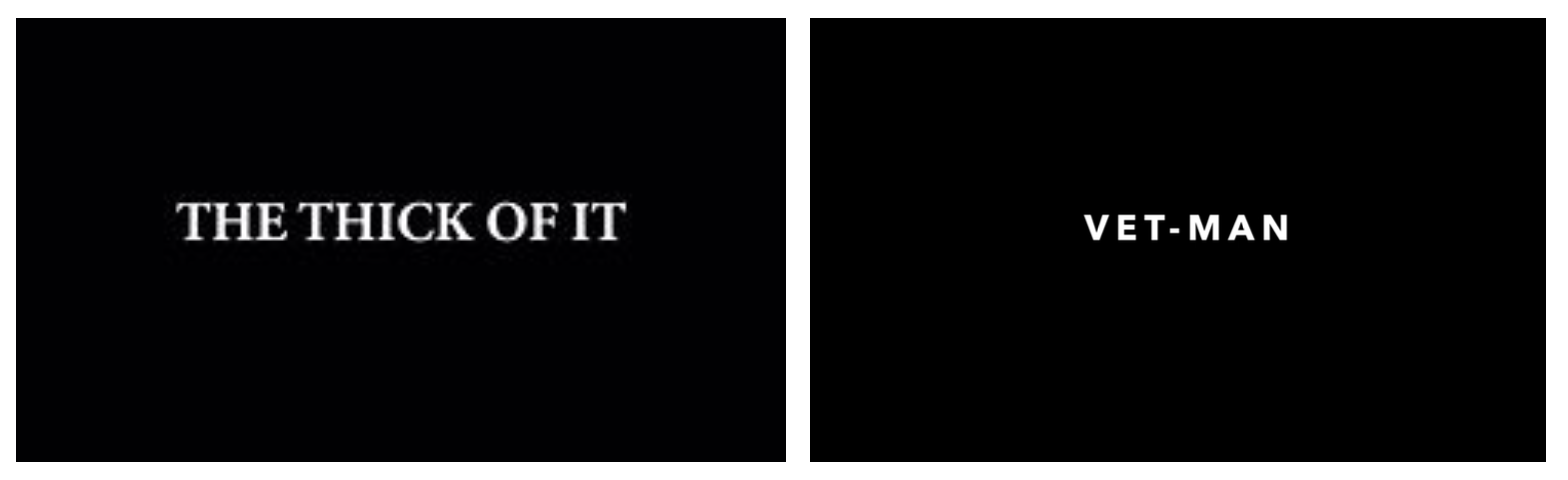 |
| The Thick Of It titles (left) our titles (right) |
Music
Alex chose the music for the film as he had a vision of what he wanted the music to sound like, however, from previous research from an article by Studio Binder, as part of my creative role of producing, I must "oversee post-production from editing, through music composition and picture lock" (StudioBinder, 2019). As I have been a part of the editing by creating the rough cut, scheduling fine cut reviews with Katie and giving feedback, this means that I have successfully been a part of the editing and picture lock. To follow through with my research, the producer is also involved with finer details such as the music, as a result of this I had to be a part of the music choices. I was happy for Alex to choose the music as long as I could review his choices to see if they fitted with the style of VET-MAN. We originally didn't want to include any as our inspiration The Thick Of It doesn't have any music. However, we received feedback about adding music a few times during our viewings. As a result of this we decided to include a small amount. Alex decided that the best place to put the music was when we were inside Tim's mind when he believed he was being a successful vet. Along with my jump cuts, this may help bring this idea across to the audience. To reflect this, Alex wanted a superior theme to the music and then the idea of it stopping when we are back into reality, for example music over the surgery scene and then cut it when he slips and kills the dog. Once we cut back into reality and the music stops, we hope to make the audience believe we are now out of Tim's mind. Although we were undecided about music, we knew we wanted some in the night scene due to the lack of dialogue. Alex suggested from the start to have a 'heist' type of music, which I agreed fit really well. I was confident with all Alex's choices surrounding the music. I really liked the idea of cutting it when we are back in reality, I think this will help the idea of Tim feeling superior. As I was happy with the music, they went ahead and put it into the places that Alex explained, I was very confident once I heard the edit back with the music. I think we have developed the film so far since the first rough cut that I created.
Reflection
- Overall, I think the film is coming along really well. The colour grade has made a big impact on the film and has improved it massively. The first scene was a horrible shade of yellow due to the sunlight reflecting off the curtains, however, Katie has done really well with the colour and it has more of a natural tone to it.
- The sound effects have also improved the quality of the film. As the sound effects come into the film in the fine cut, I had to edit the film without them. It was difficult to enjoy editing the film when the sound and colour hadn't been touched at that point. However, now the majority of the sound effects and the colour is almost complete, I am starting to really like the look of the film. Personally, that in itself means that the film has developed well.
- Katie has refined the edit even more than I had which is good. There are a couple of shots that she's taken out, such as the shot of the broken vase and a couple of lines from Luke. I agreed with her reasoning behind this because when she first had the fine cut she was looking at it with a fresh mind. That is what the edit needed to help refine it even further.
- I think the music brings the edit together well, and is cleverly cut around the action.
- From previous research, I discovered that the producer should understand all "aspects of production from development through to final edits" (Levinson, 2018). I believe by scheduling fine cut viewings and being there to watch and give feedback that I have taken on the creative role of producing well. I have been present throughout production and after I passed the fine cut on, I was available for viewings to ensure the film was going in the correct direction, following our original plans.
POSTER DEVELOPMENT
While I was working on the rough cut, Alex started playing around with the poster. I suggested asking Emily to create something for the poster, but we decided that we'd rather work on it ourselves for our project. Alex has had previous graphic design experience at school and he enjoys it in his spare time. As a result of this, I was happy for Alex to create the poster as he was keen to do it. Alex created a number of different examples of posters and I gave feedback on each one.
 |
| Poster 1 & 2 |
Poster 1:
In order to get an example of the first poster, Alex picked two photos we took on the last shoot day that he liked the look of. This gave us an idea of how we could develop the poster from here. We wanted Tim's authoritativeness and Luke's innocence to come through in the poster, without giving too much away. The first poster started with the blood splatter as this is quite a prominent part of the story, it also goes well with Luke holding the needle. The audience may be able to get a gist of it what the story is about. This is ideal because the audience may be more likely to watch it if they can picture a story with the poster that interests them.
I liked the photos of the characters that Alex picked because they express the personalities well that I explained in the previous paragraph. Luke looks innocent as he's holding the syringe up with the needle pointing towards his face. It's as if he doesn't realise what a syringe is for and any other person wouldn't point the sharp end towards their face. In addition to this, the way Tim is standing expresses the confidence that he believes he has as a vet. From the start Alex said that he would quite like a superhero theme to the poster to go with our title of 'VET-MAN'. I believe that we have achieved the superhero look to the poster with Tim's body language. The authoritativeness that I mentioned before gives off the superhero look, as superhero's are shown in a good light in films, where vulnerable people look up to them. However, I felt that his facial expression looked a bit cocky with the raised eyebrows and one eye open more than the other, whereas Tim's photo in poster 2 his facial expression looks more serious and wise. I think the photo of Tim in poster 2 is ideal as we want the audience to think he knows what he's doing, and then they will find out that he doesn't.
Alex also said from the beginning that he wanted a 'comic book' look to the poster if we were going down the superhero idea, but I didn't feel that the design of this poster expressed that well.
Poster 2:
I like both photos in poster 1 of Tim and Luke but I don't think they look right together. The way they're positioned makes them look as if they are two completely separate scenarios. As soon as Alex showed me poster 2 I thought that the photos looked better together. They look as if they've come from the same scenario of Tim being brave while Luke stands behind scared and hugging the bag. Once I saw these photos together I was confident that they should be shown together in the poster.
 |
| Comic strip idea with photo collage |
For this background, Alex put together a few BTS photos and stills from the edit to create a 'comic strip' look to reflect his idea of the comic book. He chose a variety of photos, and tried to include each character in the background. Reflecting on the collage, he's included Tess, Sheila, Luke, Tim, the van, the drugs and an owl.
These photos can imply 'spoilers without context', as they include each aspect of the film, but the audience wouldn't be able to work out what happens from these photos. These types of posts are very popular on Twitter with the most popular at the moment being about Avengers: End Game. As Avengers: End Game is such a long-awaited film that is part of a very well-known franchise, viewers are worried that they'll see spoilers about the film before they've seen it. As a result of this, people who were first to see it have been posting 'spoilers without context' where there are a number of completely different photos that make no sense unless you've seen the film. As this is very popular with a big franchise like Marvel, it may be worth using this idea in the poster. The only problem surrounding this idea is that you can't really see each photo in the background so the audience wouldn't be able to see the spoilers anyway. However, the background does take some of the focus off Tim and Luke and the meaning behind their body language. Although both ideas of the photo collage and the positioning of Tim and Luke are good ideas, they don't quite work together. I fed back that maybe a plain coloured background would be more suitable, as long as it's not white. I feel that the background would need to be a colour of some sort.
Another point that I fed back to Alex was that I wasn't too keen on the spots on Tim and Luke's faces. like the spotty comic look to the background, but it didn't look right on their faces. Alex took on this feedback and removed the spots from their faces.
I think that there is a lot going on in poster 2, and I feel that the focus should be on the main characters rather than the background that you can't really see anyway. After feeding this back to Alex he started on poster 3.
 |
| Poster 3 & 4 |
Poster 3:
The poster has developed well without the spotty effect on the faces. I also quite like the plain background. That particular shade of grey brings out the colour in the rest of the poster, and keeps the focus on the characters. This is what I fed back about in the previous poster so I was immediately drawn to this. Although he has kept this idea all the way through the posters, I like the white outline around the characters. Even without the comic strip background, the outline gives off a cut out / pop art / comic look to it, which is what Alex originally wanted to go for to combine with the superhero idea.
I also like the new VET-MAN title rather than the logo we've been using for social media. As we've been looking at the VM logo throughout the project, it looks slightly boring and uninteresting on poster 1. It also looked as if it had a 'cut and paste' look to it, whereas, we want the poster to wow the audience and for it to be slightly different to the photos and videos I have already posted on the social media. I think the new title also gives off the comic book idea we want to come across. The bold, white writing stands out well too, it shouts 'VET-MAN' which is ideal for a poster in order to grab people's attention.
Similarly to the spotty effect on the skin, I wasn't sure it looked right on the white title. Looking at poster 4, the title without the spotty effect looks as if it stands out more. I believe that the bolder, the better on a poster.
Poster 4:
As we were starting to like the basic features of the poster, it was time to add more detail. For example, we all liked the positioning of the characters, the colours, and comic book effect, so now it was time to add in the titles that are featured at the bottom of every film poster, detailing the cast and main members of crew. From the start I wasn't keen on Ed and Dan's name at the top of the poster. I thought it should be featured in the small writing at the bottom. As we were happy with the poster design, it was just a case of rearranging the bottom titles and making them smaller as I felt that they took up too much from where they are positioned in poster 4. Alex made them fit on two lines and they looked a lot better and more professional.
Once we had established the final poster, I contacted my local copy shop to get the poster printed in high quality, size A1. We also opted for a matt finish. We thought glossy may become too reflective so matt was the safer option. I collected the poster later that day.
The final poster

Reflection
- While Alex was creating the different poster examples, I thought that I had made the right decision in letting us create the poster rather than asking Emily to create something. When we had our final poster, I thought that I could have considered asking Emily to create something anyway in case we were to like hers more or even if we liked different aspects about it to add to ours. Nevertheless, I am extremely happy with the outcome and I like the idea that we have created it to help showcase our project.
- I think the photos chosen reflect Tim and Luke's personalities well. We were lucky to have two extremely good cast members for our main characters to help portray these characters well. Their body language and facial expressions look very effective on the poster, and give off the correct impression for the type of film we have created.
- I really like the colours used in the final poster. As I said previously, I like the grey as it helps bring out the other colours well. I think the comic book idea has come across well with the spotty effect on the background, the white outline and the banner-like title. The white writing also looks good on the darker background. I am glad our photos have a darker tone so we can see the white writing well. I don't think it would have looked as effective if the colour scheme of the poster was made up of light colours with darker coloured writing.
References:
- StudioBinder. (2019). What Does a Producer Do: The Various Types of Producers in Film & TV. Available: https://www.studiobinder.com/blog/what-does-a-producer-do/. Last accessed 24th April 2019.
- Thom, R. (n/d). ADR. Available: http://filmsound.org/terminology/adr.htm. Last accessed 9th March 2019.
- Thom, R. (n/d). ADR. Available: http://filmsound.org/terminology/adr.htm. Last accessed 9th March 2019.


No comments:
Post a Comment